Set Up Mobile App Dashboard
Now let's set up the mobile UI for our device.
In Blynk you can build different dashboards for the web and for the mobile app. Because screen sizes are different, you can adapt the interface to make it user-friendly.
You would need Blynk mobile app for iOS or Android to continue. Make sure Developer mode is turned On in your Profile.
Select the Template
Click on the Wrench Icon to get to the list of templates.
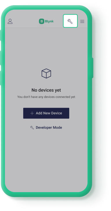
Tap on the template you would like to work with. If you are new to Blynk and used the Quickstart flow to get your device online, there will be just one template named Quickstart Template. Now you can configure how your devices should work in the mobile app.
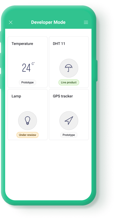
Choose the Tile Design
You can choose how a device tile will look in the list of devices when added using this template.
There are currently 8 Device Tile presets with different interactions:
Key Value – shows Datastream value in real-time (e.g.: temperature, volume, percentage, etc.)
Button – tap on the Device Tile will trigger an action or toggle ON/OFF state. Tap on the name to open the device dashboard
Level – visualizes a certain level (brightness, power, etc.) based on selected Datastream value
Color – indicates color, brightness, etc., and can quickly turn the device ON/OFF. Tap on the name to open the device dashboard
Image (default) – shows device image or icon. Tap anywhere will open the device dashboard
Gauge - displays values of datastream of data type integer as a gauge. The visual options that may be set are:
Template Icon - the icon chosen here will be the default device icon.
Value - the display of the numerical value under the gauge may be enabled or disabled. Choose the color, alpha, or define custom colors for the value based on the datastream value.

Label - choose an icon (optional), and/or a label. A switch enables or disables the display of the label + icon above the gauge. The icon and label color may be customized.

Gauge - set the line width and gauge color. The gauge color can be solid and with a specific color and alpha, or choose ‘Ramp’ and to assign either a linear or step gradient with up to six colors and datastream values.

Indicator - set the style (dot or tick), and the color of that indicator.

3 Labels – you can display up to 3 important values plus a switch control
2 Labels – you can display up to 2 values, plus a switch control
Android: To choose the Device Tile preset, tap on the gear icon, choose ‘TILE TYPE’ and then choose from ‘Key Value’, ‘Button’,’Level’, ‘Color’, ‘Image’, ‘3 Labels’, or ‘Gauge’. Assign a ‘TILE TYPE’, ‘TILE DATASTREAM’, and then click on the ‘Tile Design’ option at the bottom of the screen to change the visual settings. Click on the ‘Settings’ gear icon at the bottom to vary the simulated datastream values so you can confirm the appearance settings you defined for the tile.

iOS: To choose the Device Tile preset tap on the gear icon and after that on three dots in the top right corner. Tap Change tile type and you'll see the full list of tile type options.

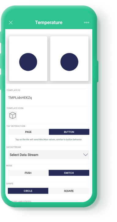
Let's select Button for this demonstration (you can edit it later). On choosing the preset, tile settings will open. Select the datastream that will be linked to the tile action.
Select the Tap Interaction - Button and the Button Mode - Switch. It will allow toggling the device ON/OFF when tapping on the device tile. Press OK.
Create Mobile Dashboard
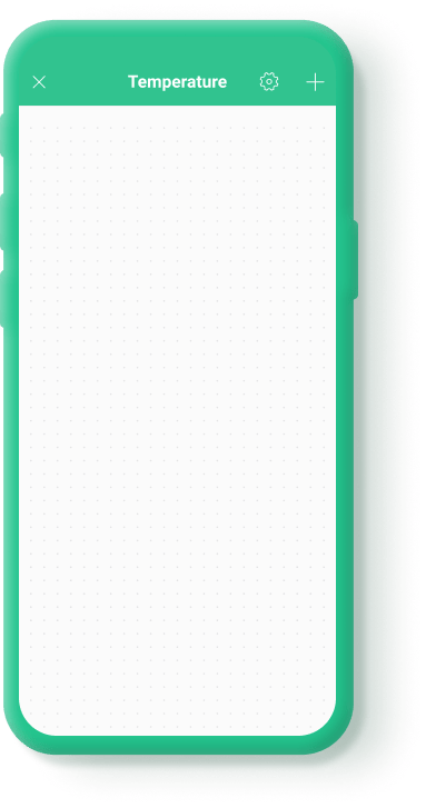
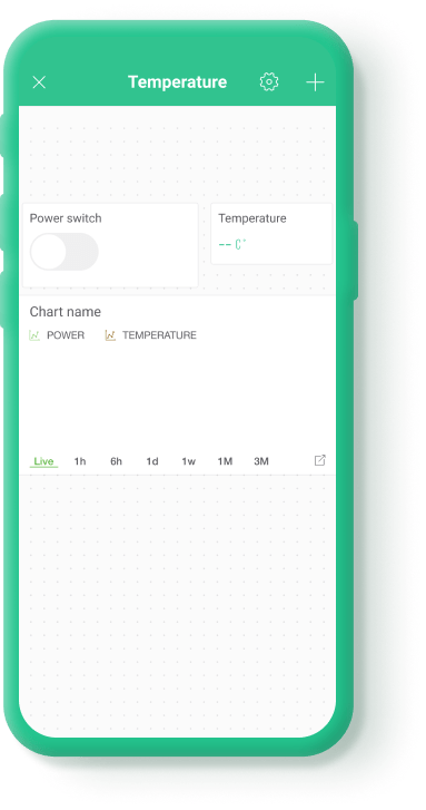
Now you can start building a mobile UI for your device. Tap anywhere on the canvas and add these widgets:
Button
Labeled Value
SuperChart
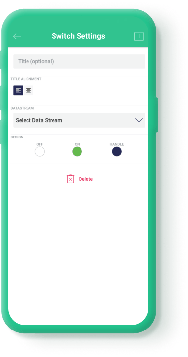
Button Widget Settings
Give it a title (optional), select the datastream.
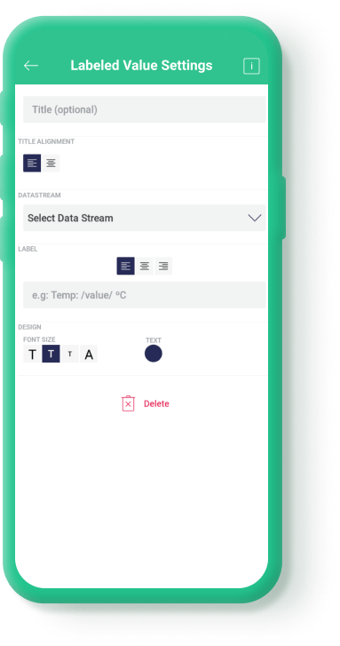
Labeled Value Settings
For example, you want to show a temperature in the labeled value widget. Pick a datastream for temperature, also you can choose to use Title filed to place the label above the value or Label filed to configure the message of your choice, placing the text before and/or after the value.
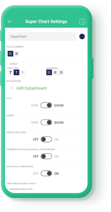
SuperChart Widget Settings
Now choose a SuperChart widget, set up 2 datastreams for example for power and temperature.
Now your template is ready. Let's finish with the sketch and make it work.
Last updated
Was this helpful?

