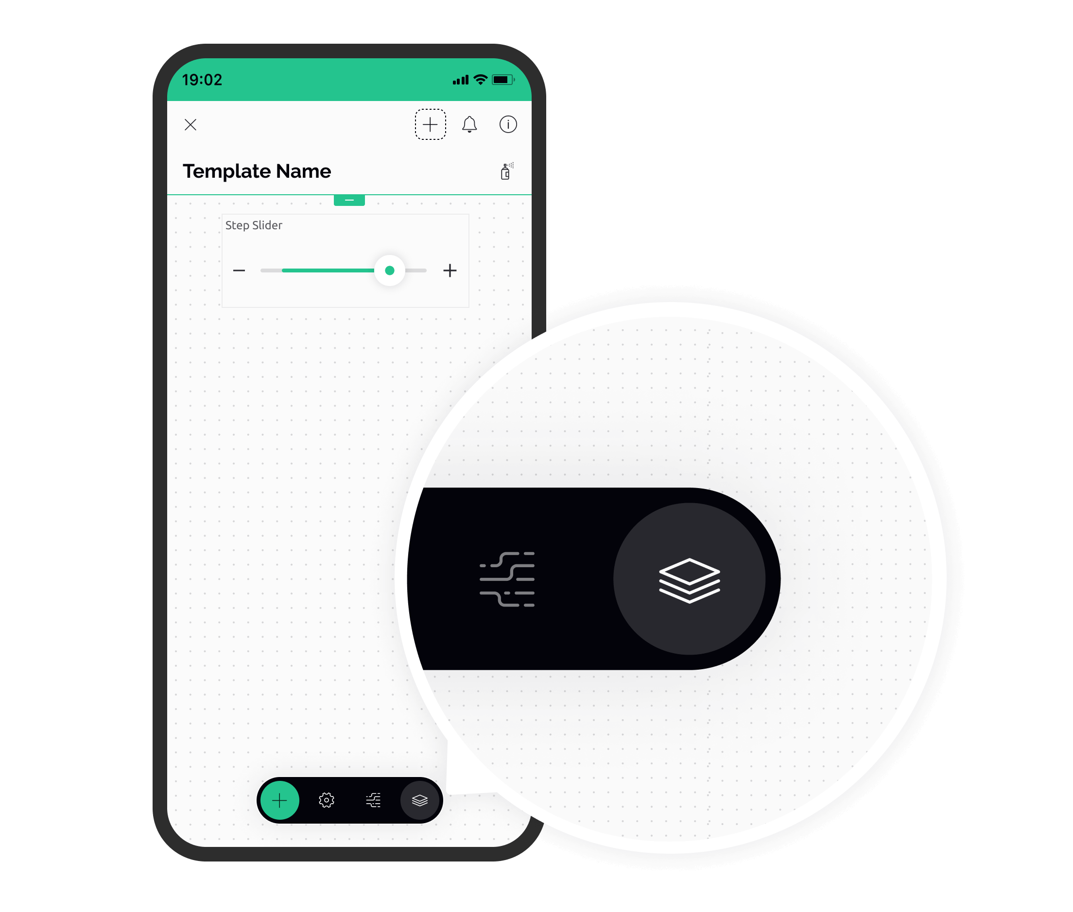
# Pages
With **Pages** you can add multiple pages to a device dashboard. This helps to better organize the UI and build connections between sections of your device dashboard.

### Examples of page use
* **Device Settings.** Let's say you plan to use a group of widgets for various Settings. This is not something your end-users will be using very often, so it makes sense to organize Settings widgets as into a separate page. For end-users, there will be a tiny icon in the UI which will open this page.
* **View More Data.** Imagine you have a sensor value displayed on the dashboard and you would like to show more data, like historical data chart, explanations how to read this, show additional data points etc. To de-clutter the user interface, you can create a button which will open a page with all of this additional information.
* **Technical Dashboard.** Imagine you have a technical dashboard that should only be seen by users with a certain role. With Pages, you can add a tab in Device Info and define which user roles can access this tab. Users with other roles will not see this dashboard.
{% hint style="warning" %}
Pages feature is available in paid plans only. You can always upgrade in your Account Settings.
{% endhint %}
### Types of pages and navigation
There are three types of pages you can add:
* Standalone pages
* Pages (tabs) in Device Info
* Device Welcome page

Standalone Pages can be interconnected. You can open **Page A** from **Page B** or **Page C** in any order. Just keep the navigation simple and clear for end-users.
End users open Pages by tapping on widgets which are set as *entry points*. Users can always go back to the previous view.
Device Info Pages can only be accessed in Device Info view.
## Standalone pages
These pages are opened by tapping on widgets that are set as *entry points.*

You can create standalone pages of two formats: full-screen or sheets.
**Full Screen** page opens a dedicated full-screen view. Different animations of screen appearance are available (how the page appears on screen). The page can slide in from the bottom or from the right.
**Sheets** open pages as sheets from the bottom of the screen, with the option to pre-define the sheet size and can be closed by the user with a swipe.
### Examples of sheets use
* **Placing additional controls.** Create a sub-screen for additional functionality. E.g.: main screen - list of drinks, drink selection. Sheet - adjustments, settings and options for the selected drink.
* **Confirmation.** Let users confirm the effects of the selected settings.
* **Dynamic information.** Show more data, including textual, graphs, images and other that will enrich your user experience without taking the space of your main screen.
* **Quick interaction.** Imagine a weather station, or smart lighting calibration process, where users would frequently need to reset (purge) all settings.
### Creating a new page
1. Go to ToolBar → Pages → **Standalone Pages**
2. Tap **+ Add Page**
3. Give your new page a name
4. Tap **Create** in the top right corner
5. Adjust the animation or size if necessary
6. Your new page is created
### Editing a page
After you have created a new page, tap on it to start editing. You will see a familiar canvas with the grid where you can add widgets.
Tap on the gear icon to access page settings, where you can Rename or Delete the page.
You can always access all of the pages and edit them in ToolBar → Pages
### Linking page to an entry point
Once the page layout is ready, you need to define a page entry point. In Blynk, an entry point is a widget configured to open pages.
#### Widgets that can be used as entry points:
* Button
* Styled Button
* Icon Button
* Image Button
To create an entry point:

1. Add one of the supported widgets to the dashboard (check supported widgets below)
2. Open Widget Settings
3. Set **Mode** to **Page**
4. Choose the Page to open
### Opening pages by end-users
After the page has been set up and connected to an entry point widget, it's ready for use.
1. Exit Developer Mode
2. Open the device
3. Tap on the entry point widget
4. A page should open
5. Press Back to return to the entry point (or swipe down if it's a sheet)
### Changing target page from hardware
You can change the target page from the device using firmware API. When this command is used, a widget will open a page with a specified index.
Page index can be found
1. Create a new datastream. For example: `PageIndex`
2. Add a widget that should open a page
3. Set it's datastream to `PageIndex`
4. Set mode to PAGE
5. Choose default page
6. On your device use the command:
```cpp
setProperty (vPin, "page", page_index)
```
`vPin` is a Virtual Pin number of the widget.
`index` is the id of the page this widget should open. It can be found in Toolbox -> Pages.
## Device Info Tabs
You can also add Pages (in the format of Tabs) to "More.." menu on device Dashboard. By default, this view has 2 tabs: Device Info and Timeline. They can't be deleted or removed.
To see these tabs, end-users will need to open Device Info. This is the only entry point.
Unlike Standalone Pages, you can define which users can access the tab. For example, if you choose Admins only, users with other roles will not see this tab. This can be useful when you need to place some technical information which is only needed for administrators.
### Adding a device info tab
1. Go to Toolbox → Pages → **Device Info Tabs**
2. Tap **+ Add Page**
3. Give your new tab a name
4. Set access permissions (optional)
5. Tap **Create** in the top right corner
6. A new tab page is created
### Editing tab contents
After you have created a new tab, tap on it to start editing. You will see a familiar canvas with the grid where you can add widgets.
You can always access list of added tabs in ToolBar → Pages → **Device Info Tabs**
### Reordering the tabs
To change the order of tabs:
1. Tap and hold the tab you want to move
2. Drag and drop to desired position
### Deleting The Tab
To delete the tab, swipe left in the list of Tabs . Keep in mind that this will delete all widgets on the tab.
Alternatively, you can delete the tab during editing.
## Device Welcome Page
This is a special page that can be shown after the device was added using device provisioning or device claiming.
It's a good place to explain to your customers how device works, or walk them through the initial configuration.
Device Welcome Page is set up similarly to a Standalone Page described above using widgets
#### Web page
Optionally, instead of page with widgets you can set up a **web** page to show after the device was added. In this case, the in-app browser will open automatically with the specified page.
{% hint style="warning" %}
Make sure that the web page is mobile-friendly so that it renders correctly in the in-app browser.
{% endhint %}
---
# Agent Instructions: Querying This Documentation
If you need additional information that is not directly available in this page, you can query the documentation dynamically by asking a question.
Perform an HTTP GET request on the current page URL with the `ask` query parameter:
```
GET https://docs.blynk.io/en/blynk.apps/pages.md?ask=
```
The question should be specific, self-contained, and written in natural language.
The response will contain a direct answer to the question and relevant excerpts and sources from the documentation.
Use this mechanism when the answer is not explicitly present in the current page, you need clarification or additional context, or you want to retrieve related documentation sections.


