> For the complete documentation index, see [llms.txt](https://docs.blynk.io/en/llms.txt). Markdown versions of documentation pages are available by appending `.md` to page URLs; this page is available as [Markdown](https://docs.blynk.io/en/blynk.console/widgets-console/switch.md).
# Switch
{% hint style="warning" %}
***Note:*** please remember that web and mobile app widgets are set up separately in the Web Dashboard and Mobile App Dashboard sections correspondingly. They can still use the same datastreams to access the same data (Map widget is an exception – a different codebase is used for Map on mobile and web).
{% endhint %}
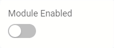
The Switch widget sends a command and displays the binary status of the device, typically 1 for ON, and 0 for OFF.
### Settings
**Title** - the label shown at the top of the widget when the option ‘Hide widget name’ is not enabled.
**Datastream** - [data type](/en/blynk.console/templates/datastreams/datastreams-common-settings/data-type.md) integer or double may be assigned.
**ON VALUE** - the numeric value you want the datastream value set to when the switch is turned on. Typically the value one (1). The range of values are constrained by the datastream [min value](/en/blynk.console/templates/datastreams/datastreams-common-settings/min-value.md) and [max value](/en/blynk.console/templates/datastreams/datastreams-common-settings/max-value.md) settings.
**OFF VALUE** - the numeric value you want the datastream value set to when the switch is turned off. Typically the value is zero (0). The range of values are constrained by the datastream [min value](/en/blynk.console/templates/datastreams/datastreams-common-settings/min-value.md) and [max value](/en/blynk.console/templates/datastreams/datastreams-common-settings/max-value.md) settings.
**Color** - The widget color takes on the assigned datastream color by default.
**Show on/off labels** - adds custom labels to identify the on/off state of the switch. When enabled, you may also right or left justify the label with the ‘LABEL POSITION’ option. The ‘Hide widget name’ hides the display of the ‘Title’ label when enabled.
**ON LABEL** - When the ‘Show on/off labels’ option is enabled, then the ‘ON LABEL’ text assigned will be displayed when the switch widget value equals the ‘ON VALUE’.
**OFF LABEL** - When the ‘Show on/off labels’ option is enabled, then the ‘OFF LABEL’ text assigned will be displayed when the switch widget value equals the ‘OFF VALUE’.
**LABEL POSITION** - When the ‘Show on/off labels’ option is enabled, this option aligns the ‘ON LABEL’ and ‘OFF LABEL’ either to the left or right of the switch.
**Hide widget name** - when enabled, hides the display of the ‘TITLE’ at the top of the widget.

---
# Agent Instructions
This documentation is published with GitBook. GitBook is the documentation platform designed so that both humans and AI agents can read, navigate, and reason over technical content effectively. Learn more at gitbook.com.
## Querying This Documentation
If you need additional information that is not directly available in this page, you can query the documentation dynamically by asking a question.
Perform an HTTP GET request on the current page URL with the `ask` query parameter, and the optional `goal` query parameter:
```
GET https://docs.blynk.io/en/blynk.console/widgets-console/switch.md?ask=&goal=
```
`ask` is the immediate question: it should be specific, self-contained, and written in natural language.
`goal` is optional and describes the broader end goal you are ultimately trying to accomplish on behalf of the user. GitBook uses it to tailor the answer towards what is most useful for that goal.
The response will contain a direct answer to the question and relevant excerpts and sources from the documentation.
Use this mechanism when the answer is not explicitly present in the current page, you need clarification or additional context, or you want to retrieve related documentation sections.