> For the complete documentation index, see [llms.txt](https://docs.blynk.io/en/llms.txt). Markdown versions of documentation pages are available by appending `.md` to page URLs; this page is available as [Markdown](https://docs.blynk.io/en/blynk.console/widgets-console/chart.md).
# Chart
{% hint style="warning" %}
***Note:*** please remember that web and mobile app widgets are set up separately in the Web Dashboard and Mobile App Dashboard sections correspondingly. They can still use the same datastreams to access the same data (Map widget is an exception – a different codebase is used for Map on mobile and web).
{% endhint %}
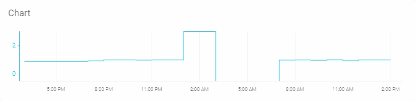
The chart widget helps you to visualize live and historical data from multiple datastreams with a [data type](https://docs.blynk.io/en/blynk.console/templates/datastreams/datastreams-common-settings/data-type) of integer or double. You can use it for sensor data, for binary event logging and more. The data may be plotted as a line, area, column (bar), or a stepline.
* **Values axis** (vertical) – each Datastream added to Chart widget has it's scale on the right and left. It can be set manually or to be auto-scaled during Template dashboard setup.
* **Timeline Axis** (horizontal) – helps to find values actual for the exact time the search is performed.
* **Hover the chart** – views value ant time for each selected point for each Datastream.
Stepline chart widget example
Area chart widget example
### **Settings**
* **Chart Title** – This is the label shown at the top of the widget. The default is the name assigned to the datastream.
* **Datastreams** – [data type](/en/blynk.console/templates/datastreams/datastreams-common-settings/data-type.md) of integer or double may be assigned. You may create a new virtual pin or enumerable datastream directly by choosing the ‘+ Create New’ option. Multiple datastreams may be plotted on the chart.
* **Edit Chart** - this option to the left of each datastream allows you to customize the appearance of the datastream values in the chart.
* **Max/Min/Avg** - choose between plotting the average, max, and minimum value.
* **Move Source** - allows you to change the order of datastreams in the legend.
* **CHART TYPE** - the data may be plotted as a line, area, column (bar), or a stepline.
* **Color** - choose the color of the line, area, column, or stepline.
* **Show Y-axis** - will display a labeled y-axis when enabled.
* **Autoscale** - automatically scales the y-axis.
* **Override Datastream’s Min/Max fields** - this option is only available when ‘Autoscale’ is disabled. When enabled, the chart y-axis scale takes on the assigned ‘MIN’ and ‘MAX’ values.
* **MINIMUM Y AXIS RANGE** - This option is only available when the option ‘Override Datastream’s Min/Max fields’ is disabled.
* **Show legend** - adds a legend to the top of the chart under the title when enabled.

---
# Agent Instructions
This documentation is published with GitBook. GitBook is the documentation platform designed so that both humans and AI agents can read, navigate, and reason over technical content effectively. Learn more at gitbook.com.
## Querying This Documentation
If you need additional information that is not directly available in this page, you can query the documentation dynamically by asking a question.
Perform an HTTP GET request on the current page URL with the `ask` query parameter, and the optional `goal` query parameter:
```
GET https://docs.blynk.io/en/blynk.console/widgets-console/chart.md?ask=&goal=
```
`ask` is the immediate question: it should be specific, self-contained, and written in natural language.
`goal` is optional and describes the broader end goal you are ultimately trying to accomplish on behalf of the user. GitBook uses it to tailor the answer towards what is most useful for that goal.
The response will contain a direct answer to the question and relevant excerpts and sources from the documentation.
Use this mechanism when the answer is not explicitly present in the current page, you need clarification or additional context, or you want to retrieve related documentation sections.