> For the complete documentation index, see [llms.txt](https://docs.blynk.io/en/llms.txt). Markdown versions of documentation pages are available by appending `.md` to page URLs; this page is available as [Markdown](https://docs.blynk.io/en/blynk.console/widgets-console/slider.md).
# Slider
{% hint style="warning" %}
***Note:*** please remember that web and mobile app widgets are set up separately in the Web Dashboard and Mobile App Dashboard sections correspondingly. They can still use the same datastreams to access the same data (Map widget is an exception – a different codebase is used for Map on mobile and web).
{% endhint %}
A Slider assigns a value to a datastream within a pre-defined range. Usage examples: volume, brightness, RPM, flap position control, etc.
Move slider handle to set the value or use fine control buttons + and – to set the value more precisely.
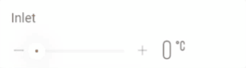
Slider widget example
The step defines the minimum increment of values generated in response to movement of the slider by the user. Note that if an IoT device or a Blynk.App widget changes the datastream value, then that change will be reflected in the slider position and value displayed.
The range of values the slider will generate is defined by the datastream [min value](https://docs.blynk.io/en/blynk.console/templates/datastreams/datastreams-common-settings/min-value) and [max value](https://docs.blynk.io/en/blynk.console/templates/datastreams/datastreams-common-settings/max-value) settings. The units displayed will also come from the datastream settings. The slider will be set to the datastream default value every time the IoT device reconnects to the Blynk.Cloud, unless the datastream option ‘Sync with latest server value every time device connects to the cloud’ is enabled. The datastream ‘Invalidate Value’ option will affect the slider’s value when enabled.
### Settings
**Title** - This is the label shown at the top of the widget. The default is the name assigned to the datastream.
**Datastream** - data type integer or double may be assigned.
**Color** - The widget color takes on the assigned datastream color by default.
**Send values on release only** (optimal) - when enabled, the datastream is assigned a value only when the user releases the control (recommended setting). When disabled, all the values set as the user moves the slider will be assigned to the datastream.
**HANDLE STEP** - defines the minimum increment / decrement of the values as the slider position is changed by the user. The step value is a whole integer when the datastream data type is integer, and a decimal value when the datastream data type is double.
**Show fine controls** - adds a ‘-’ and ‘+’ to either side of the slider when enabled. The increment or step for this option is set by the ‘FINE CONTROL STEP’ option.
**FINE CONTROL STEP** - defines the minimum increment / decrement of the values as the ‘-’ and ‘+’ to either of the slider is clicked by the user. This option is only visible when ‘Show fine controls’ is enabled.
**VALUE POSITION** - sets the position of the slider value displayed to either the left or right of the slider handle.

---
# Agent Instructions
This documentation is published with GitBook. GitBook is the documentation platform designed so that both humans and AI agents can read, navigate, and reason over technical content effectively. Learn more at gitbook.com.
## Querying This Documentation
If you need additional information that is not directly available in this page, you can query the documentation dynamically by asking a question.
Perform an HTTP GET request on the current page URL with the `ask` query parameter, and the optional `goal` query parameter:
```
GET https://docs.blynk.io/en/blynk.console/widgets-console/slider.md?ask=&goal=
```
`ask` is the immediate question: it should be specific, self-contained, and written in natural language.
`goal` is optional and describes the broader end goal you are ultimately trying to accomplish on behalf of the user. GitBook uses it to tailor the answer towards what is most useful for that goal.
The response will contain a direct answer to the question and relevant excerpts and sources from the documentation.
Use this mechanism when the answer is not explicitly present in the current page, you need clarification or additional context, or you want to retrieve related documentation sections.